Chalkboard Style Graphics: When Handcrafted Beats Polished
There's a reason chalkboards persist in a digital world. The hand-drawn aesthetic signals expertise, approachability, and trustworthy guidance.
Paul Saunders
Founder, Smash It Marketing

Walk into any university lecture hall or business workshop, and you'll likely see a chalkboard or whiteboard covered in hand-drawn diagrams.
There's a reason educators have used this format for centuries: it works.
Hand-drawn visuals communicate differently than polished graphics. They suggest teaching, expertise, and genuine knowledge transfer.
The Psychology of Chalkboard
Chalkboard aesthetics trigger specific associations:
Education: Schools, universities, training sessions. Places where trusted experts teach valuable information.
Expertise: The person writing on the board knows something you don't. They're breaking down complex ideas into understandable components.
Process: Ideas emerging in real-time. The sense of watching knowledge unfold rather than receiving packaged information.
Approachability: Hand-drawn feels human. It's the opposite of cold, corporate perfection.
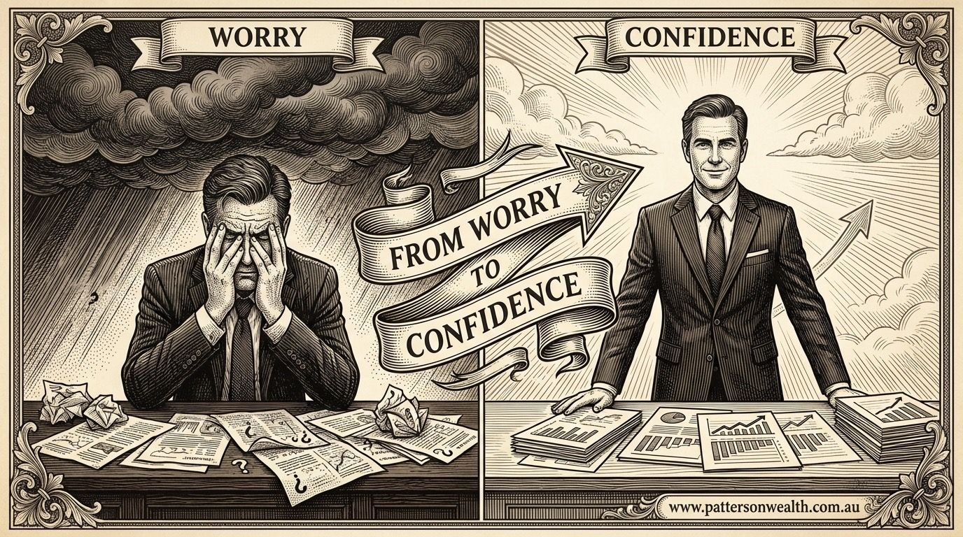
These associations transfer to your marketing. A financial advisor explaining retirement strategies in chalkboard style feels like a trusted teacher, not a salesperson.
Where Chalkboard Works Best
Professional Services
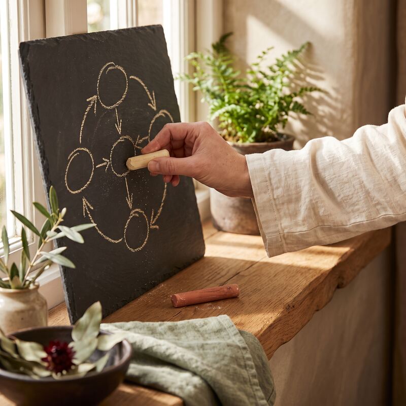
Accountants, lawyers, consultants, and advisors benefit enormously from chalkboard aesthetics. Their value proposition involves expertise and guidance—exactly what chalkboard signals.
An accountant explaining tax strategies looks more credible in chalkboard style than in corporate photography.
Education and Training
Online courses, coaching programs, and training materials naturally fit the chalkboard style. It reinforces the learning context.
B2B Services
Business-to-business companies often struggle with visuals. Product photography doesn't apply. Service photography feels generic.
Chalkboard graphics visualise concepts, processes, and frameworks—the actual intellectual property these businesses sell.
Complex Explanations
When you need to explain something complicated, chalkboard style implies "let me break this down for you." It sets expectations for learning rather than selling.
The Chalkboard Aesthetic
Effective chalkboard graphics share common elements:
Dark backgrounds: Traditional green or black, or modern slate variations.
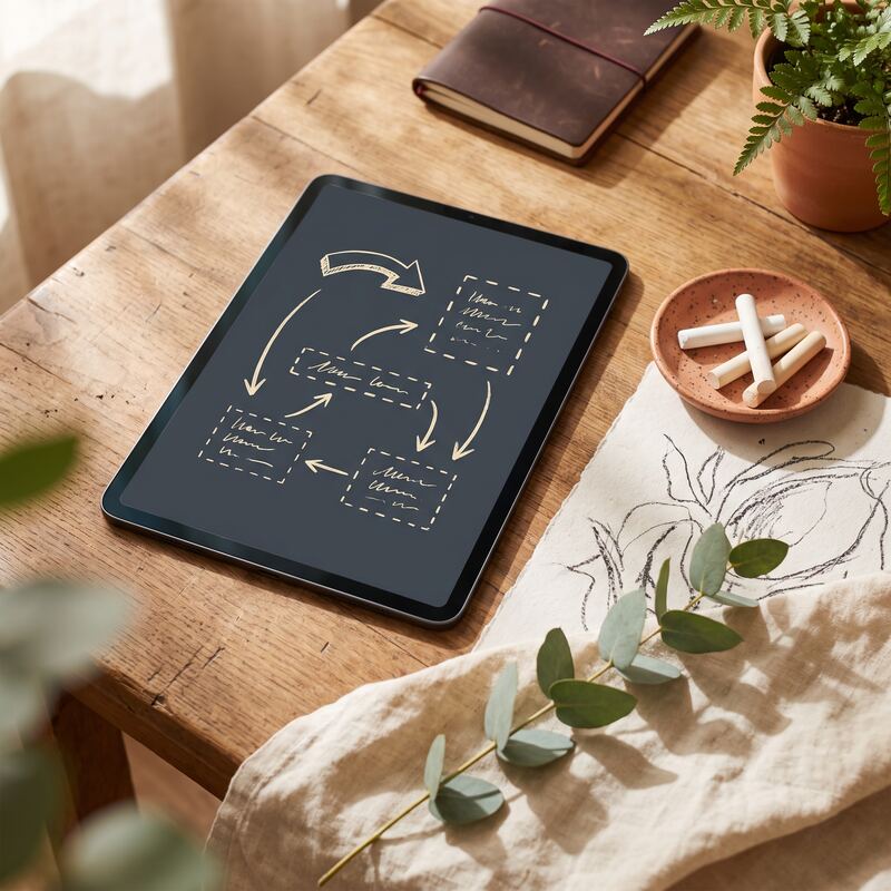
Light "chalk" lines: White, cream, or coloured elements suggesting chalk or whiteboard markers.
Sketch-like quality: Not perfect geometry, but deliberate imperfection suggesting hand-drawn creation.
Educational elements: Arrows, diagrams, flowcharts, equations, and explanatory text.
Space and margins: Chalkboards don't fill every inch. Breathing room feels intentional.
Modern Variations
The chalkboard style has evolved beyond literal chalk:
Glass board effect: Transparent surface with floating elements.
Whiteboard style: Clean white backgrounds with marker-style graphics.
Notebook effect: Lined or grid paper with hand-drawn elements.
Digital sketch: The hand-drawn quality without specific board context.
All variations maintain the core benefit: the impression of knowledge being shared rather than marketing being pushed.
Implementation Considerations
When to Use Chalkboard
- Explaining processes or frameworks
- Educational content marketing
- LinkedIn thought leadership posts
- Training material illustrations
- Service explanations
- Concept visualisations
When to Avoid Chalkboard
- Product photography (where literal product images matter)
- Luxury brands (chalkboard feels too casual)
- Youth-focused brands (can feel dated)
- Fast-moving consumer goods (energy doesn't match)
Quality Matters
Poor chalkboard execution looks amateurish. The hand-drawn style requires:
- Consistent visual language
- Professional composition
- Deliberate (not sloppy) imperfection
- Clear hierarchy and readability
Creating Chalkboard Graphics
Three approaches:
Manual creation: Actually draw on a board and photograph. Authentic but time-consuming and hard to edit.
Design tools: Create chalkboard-style graphics in design software. Requires skill but offers flexibility.
Specialised services: Work with designers or services that specialise in this style. Consistent quality without the learning curve.
Consistency Across Platforms
Whatever approach you choose, consistency matters.
A LinkedIn post in chalkboard style should feel connected to your website graphics, which should feel connected to your presentation slides.
This doesn't mean identical—it means recognisably from the same brand.
The Competitive Angle
Scroll through any professional service firm's social media. Most use:
- Generic stock photography
- Corporate template graphics
- Text-heavy slides
Chalkboard style stands out because it's distinctive. It requires intention that lazy competitors don't invest.
When everyone looks polished and corporate, hand-drawn authenticity becomes the differentiator.
Making the Decision
Chalkboard style works when:
- Your value proposition involves expertise
- Your audience expects education, not entertainment
- Your competitors look generic and corporate
- You're explaining rather than showcasing
If these describe your business, the chalkboard aesthetic deserves serious consideration.
Want to see your brand in chalkboard style? Our Creative Packs include chalkboard-style graphics designed for your specific business. See examples or contact us for a custom preview.
Related services: data-led content creation backed by SEO, and ready-made Creative Packs for branded graphics.
Paul Saunders
Founder of Smash It Marketing — a boutique, AI-first agency pairing 18 years of Google Ads with an AI-first service suite. Book a call.