Corporate Style Graphics: Professional Visuals for B2B Marketing
Some audiences expect polish. Corporate style graphics deliver the professional aesthetic that B2B buyers trust.

Paul Saunders
Founder, Smash It Marketing
Not every audience wants creative.
When a procurement manager evaluates suppliers, they're not looking for playful illustrations. They want signals of competence, reliability, and professionalism.
That's where corporate style graphics earn their place.
The Corporate Aesthetic
Corporate style graphics share common characteristics:
Clean lines: Precise geometry, no rough edges or hand-drawn elements.
Structured layouts: Grid-based designs with clear organisation.
Muted colours: Blues, greys, and neutral tones that convey stability.
Professional photography: High-quality images of business settings, technology, and professional scenarios.
Conservative typography: Sans-serif fonts that prioritise readability over personality.
White space: Breathing room that signals confidence and clarity.
This aesthetic says: "We're serious professionals who know what we're doing."
Who Benefits from Corporate Style

Professional Service Firms
Lawyers, accountants, and consultants serve clients who expect professional presentation. Playful graphics might undermine credibility with enterprise clients.
Financial Services
Banking, insurance, and investment firms deal with people's money. Corporate aesthetics reinforce the trustworthiness essential to financial relationships.
B2B Technology
Enterprise software companies selling to corporations need visuals that fit procurement committee presentations. Quirky branding won't clear the vendor approval process.
Healthcare (Administrative)
Medical administration, health tech, and healthcare B2B services need corporate polish while remaining appropriately serious about health matters.
Engineering and Industrial
Technical businesses serving other businesses benefit from clean, precise graphics that mirror their engineering precision.
When Corporate Works
Corporate style succeeds when:
Your buyers are senior professionals: C-suite executives expect materials that reflect their professional environment.
Purchasing is committee-driven: Materials must survive multiple reviewers with different preferences.
Trust is paramount: Decisions involving significant investment or risk require signals of reliability.
Your industry has conservative norms: Some industries penalise businesses that deviate from expected aesthetics.
You're establishing initial credibility: Before you've proven yourself, professional presentation matters more.
When Corporate Falls Short
Corporate style can fail when:
You're targeting entrepreneurs: Small business owners often respond better to approachable, less formal visuals.
Differentiation matters most: In crowded markets where everyone looks corporate, standing out becomes impossible.
Your service is creative: A design agency using corporate graphics creates brand contradiction.
Younger audiences are primary: Millennial and Gen Z buyers often prefer more distinctive visuals.
The Balance Challenge
Many businesses struggle between appearing:
- Professional enough for enterprise clients
- Distinctive enough to be memorable
The solution often involves:
- Corporate as the base layer
- Subtle distinctive elements for differentiation
- Consistent application across all materials
A law firm might use corporate style with a distinctive colour accent. Professional but recognisable.
Corporate Style Elements

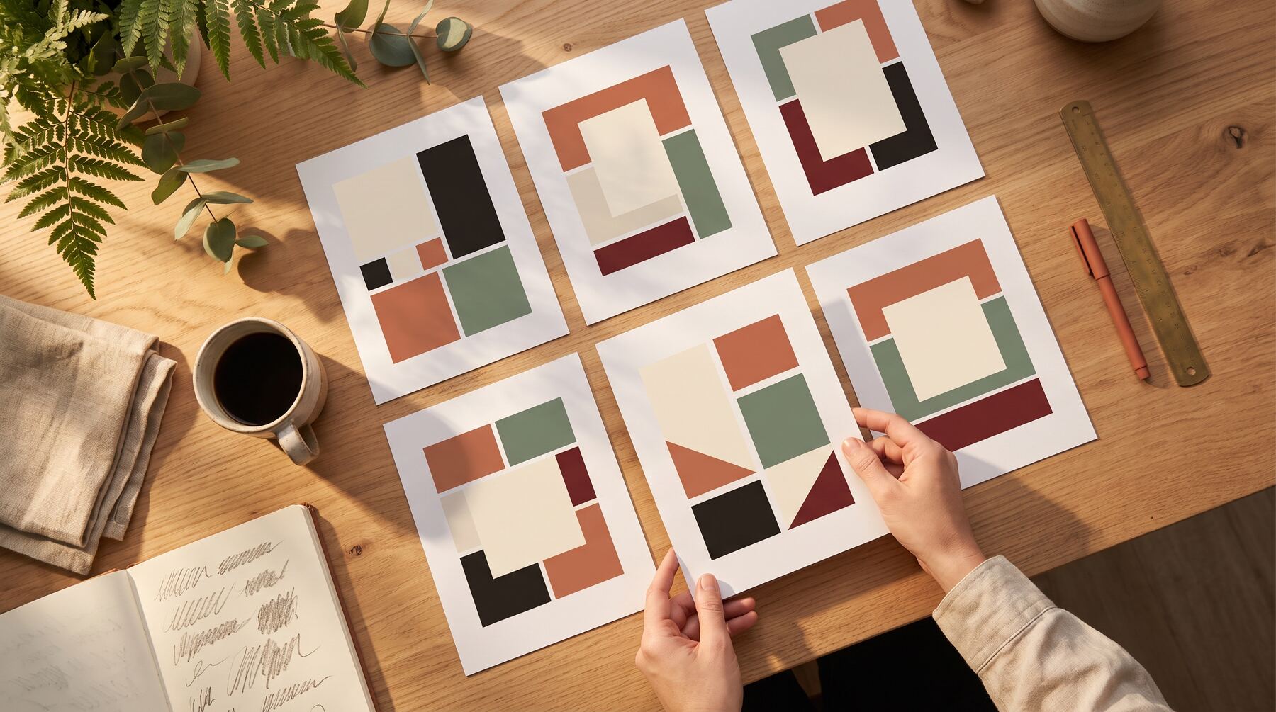
Colour Palettes
- Navy blue (trust, authority)
- Grey (sophistication, neutrality)
- White (cleanliness, clarity)
- Accent colours used sparingly (usually blues, greens, or burgundy)
Photography Choices
- Professional office environments
- Business people in appropriate attire
- Technology and equipment
- Abstract corporate imagery (handshakes, graphs, skylines)
Typography
- Clean sans-serif fonts
- Professional serif fonts for headings
- Consistent hierarchy
- Generous spacing
Layout Principles
- Grid-based structure
- Aligned elements
- Balanced composition
- Clear information hierarchy
Implementation Considerations
Consistency is Everything
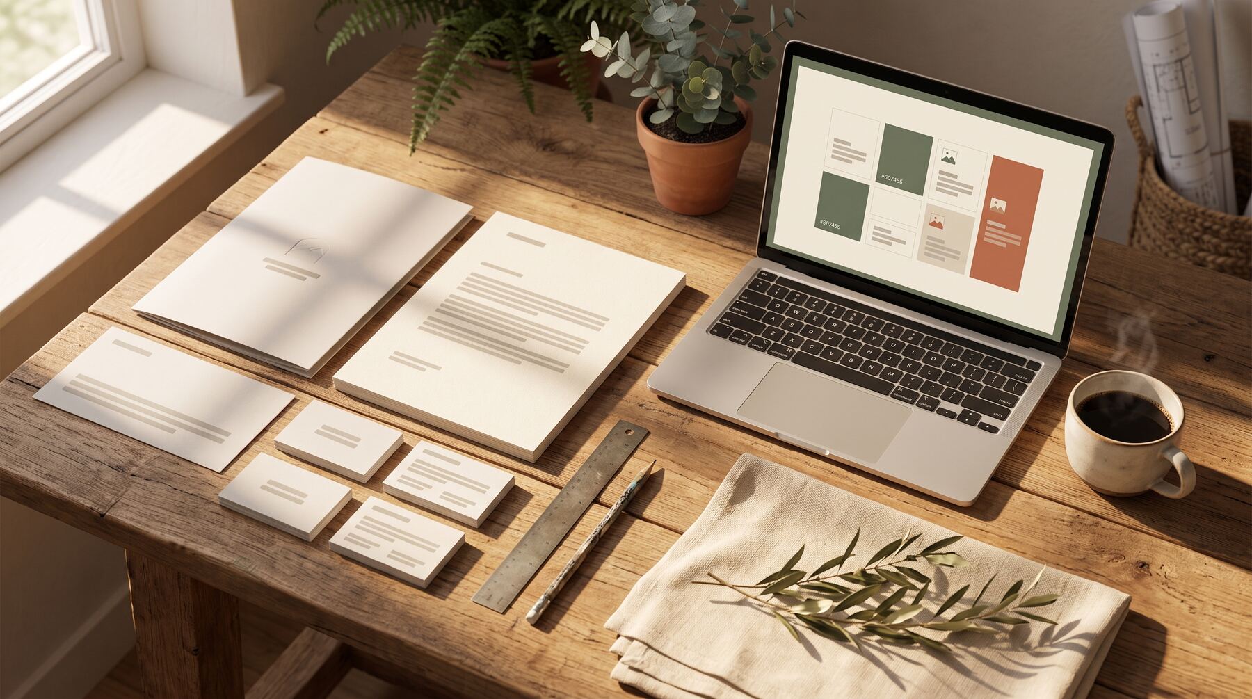
Corporate style loses power when applied inconsistently. Every touchpoint must reinforce the same aesthetic:
- Website
- Social media
- Sales materials
- Email signatures
- Presentations
- Business cards
One off-brand piece undermines the whole system.
Quality Over Creativity
Corporate style demands execution quality. Poorly designed corporate graphics look worse than poorly designed casual graphics because the contrast with professional expectations is sharper.
Invest in proper design or use professional services.
Update Cycles
Corporate styles age. What looked professional in 2015 looks dated in 2025. Plan for periodic refresh cycles to keep materials contemporary.
The ROI Consideration
Corporate graphics cost more than casual alternatives because:
- Higher design standards require more skill
- Photography needs professional quality
- Consistency requires systematic thinking
- Updates need coordinated execution
But for B2B businesses, this investment returns through:
- Higher close rates on enterprise deals
- Faster trust establishment
- Reduced sales friction
- Premium price positioning
The maths often favours the investment.
Need corporate graphics that match your professional positioning? Our Creative Packs include corporate style options designed for B2B marketing. See examples or contact us for a custom preview.
Related services: data-led content creation backed by SEO, and ready-made Creative Packs for branded graphics.
Paul Saunders
Founder of Smash It Marketing — a boutique, AI-first agency pairing 18 years of Google Ads with an AI-first service suite. Book a call.