Isometric Modern Style: The Tech-Forward Visual Approach
Isometric graphics—those clean, angled 3D illustrations—have become the visual language of modern technology. Here's when they work for your brand.
Paul Saunders
Founder, Smash It Marketing
You've seen them everywhere.
Those perfectly angled 3D illustrations. Floating devices. Interconnected systems. Clean lines at precise 30-degree angles.
Isometric design has become the default visual language of the tech industry. And for good reason.
What Makes Isometric Distinct
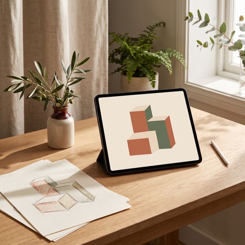
Isometric projection displays three-dimensional objects without perspective distortion. All parallel lines remain parallel. All objects maintain consistent scale regardless of position.
The result is a clean, systematic aesthetic that feels both technical and accessible.
Key characteristics:
- 30-degree angles (the defining feature)
- No vanishing points
- Flat surfaces with dimensional depth
- Clean, geometric shapes
- Consistent lighting
- Often combined with gradient colours
This style emerged from technical drawing but has evolved into a distinctive brand aesthetic.
Who Uses Isometric Style
Technology Companies
SaaS platforms, app developers, and tech startups have embraced isometric illustration as their visual vocabulary. It signals:
- Technical sophistication
- Modern approach
- Systematic thinking
- Innovation focus
Digital Services
Agencies, consultancies, and service providers in digital spaces use isometric to position as forward-thinking and technically capable.
AI and Automation
Businesses working with AI, automation, and emerging technology find isometric style aligns perfectly with their subject matter.
Innovation-Focused Brands
Any business wanting to position as innovative can use isometric style to signal modernity.
Why Isometric Works
It Explains Complexity
Isometric graphics excel at illustrating:
- Systems and processes
- Data flows
- Connected components
- Technical concepts
What's difficult to explain in text becomes clear in isometric illustration.
It Looks Expensive
Quality isometric illustration requires skill. The style signals investment in brand presentation.
It Photographs Poorly
Tech companies often can't photograph their products meaningfully. What does "cloud software" look like? Isometric provides visual representation for abstract concepts.
It's Universally Modern
Unlike some design trends, isometric reads as "modern" across different cultures and demographics.
Isometric Style Elements
Colour Approaches
Gradient dominance: Rich gradients give flat surfaces depth and vibrancy.
Brand colour integration: Isometric works with any colour palette when applied consistently.
Limited palette: Often 3-5 colours create more sophisticated results than rainbow approaches.
Common Subjects
- Floating devices (phones, laptops, monitors)
- Building blocks and construction metaphors
- Data visualisation elements
- People in simplified style
- Workspace environments
- Abstract systems and connections
Composition Principles
- Central focal point
- Elements at consistent angles
- Layered depth (foreground, midground, background)
- Connecting lines or pathways
- Balanced negative space
When Isometric Falls Short
Not every brand benefits from isometric style:
Traditional industries: A law firm or funeral home using isometric might create brand confusion.
Handmade/artisan positioning: The technical aesthetic contradicts craft messaging.
Personal service brands: The systematic feel can seem impersonal for businesses built on relationships.
Budget positioning: Isometric signals investment. Discount brands may find it incongruent.
Implementation Approaches
Custom Illustration
Commission original isometric illustrations for your specific concepts and brand.
Pros: Unique, perfectly aligned with messaging Cons: Higher cost, requires talented illustrators
Modified Templates
Start with isometric templates and customise colours, elements, and compositions.
Pros: Faster, more affordable Cons: Less unique, limited flexibility
Asset Libraries
Use pre-made isometric elements arranged into custom compositions.
Pros: Consistent style, quick production Cons: May see similar assets elsewhere
Consistency Matters
- Same angle conventions across all graphics
- Consistent colour palette
- Similar illustration complexity
- Uniform lighting direction
- Cohesive element style
Mixed execution undermines the systematic aesthetic that makes isometric effective.
Platform Considerations
Website
Isometric hero images, feature illustrations, and process diagrams work excellently.
Social Media
Isometric stands out in LinkedIn feeds dominated by photography. Use for thought leadership and service explanation content.
Presentations
Isometric slides look modern and professional. Excellent for pitch decks and proposals.
Isometric translates well to print materials, maintaining clarity at various sizes.
Making the Decision
Isometric modern style fits when:
- Your business involves technology or innovation
- You want to position as forward-thinking
- You need to explain complex systems visually
- Your competitors look dated or generic
- Your audience expects modern aesthetics
If these describe your situation, isometric deserves serious consideration.
Want to see your brand in isometric modern style? Our Creative Packs include custom isometric graphics designed for your specific business concepts. See examples or contact us for a custom preview.
Related services: data-led content creation backed by SEO, and ready-made Creative Packs for branded graphics.
Paul Saunders
Founder of Smash It Marketing — a boutique, AI-first agency pairing 18 years of Google Ads with an AI-first service suite. Book a call.