The Infographic Style: Data Visualisation That Actually Gets Shared
Numbers tell stories. Infographic style graphics transform boring statistics into shareable visual content that drives engagement.

Paul Saunders
Founder, Smash It Marketing

Every business has numbers worth sharing.
- "We've helped 500+ clients"
- "Average 340% return on ad spend"
- "15 years of experience"
- "98% client retention rate"
But numbers alone don't engage. They need visual context.
That's where infographic style graphics excel.
Why Infographics Work
The human brain processes visuals 60,000 times faster than text. When data becomes visual:
Comprehension increases: People understand what the numbers mean, not just what they are.
Retention improves: Visual data is remembered longer than text data.
Shareability rises: Infographics are shared 3x more than other content types on social media.
Authority builds: Presenting data visually suggests you track, measure, and care about results.
Elements of Effective Infographics
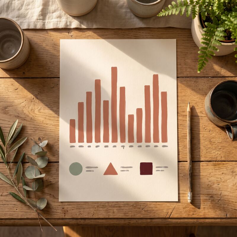
Charts and Graphs
Bar charts, pie charts, line graphs—the classics exist because they work. The key is choosing the right type:- Bar charts: Comparing quantities
- Pie charts: Showing proportions (use sparingly)
- Line graphs: Showing trends over time
- Donut charts: Modern proportion display
Icons and Symbols
Visual shorthand that makes data scannable. A dollar sign for revenue, a person icon for clients, a clock for time saved.Numbers with Context
"340%" means nothing alone. "340% average ROAS" tells a story.Colour Coding
Colours group related information and draw attention to key figures.Hierarchy
What's the most important number? Make it biggest. Support it with secondary data.When Infographics Beat Other Styles
Case Studies
Before/after metrics visualised as charts show transformation more powerfully than text descriptions.Industry Reports
Market statistics, survey results, and trend data demand visualisation.Process Explanations
Step-by-step workflows with associated metrics at each stage.Performance Summaries
Monthly reports, year-in-review, milestone achievements.Comparison Content
Pricing tiers, feature comparisons, competitive analysis.Infographic Style Applications
LinkedIn Posts
Data-driven posts consistently outperform opinion posts. An infographic showing industry statistics positions you as an informed voice.Website Hero Sections
Lead with your best numbers. "500+ clients served" with supporting visual elements.Sales Materials
Proposals and pitch decks become more compelling with visualised ROI data.Email Marketing
Infographic snippets increase click-through rates on newsletters.Blog Content
Complex articles benefit from infographic summaries that readers can scan.Creating Effective Infographics

Start with the Story
What's the one thing you want viewers to take away? Build around that.Choose Data Carefully
Too many numbers dilute impact. Three to five key statistics usually works better than ten.Design for Scanning
Most viewers spend seconds on content. The main message should land instantly.Maintain Brand Consistency
Infographics should feel connected to your other marketing materials.Optimise for Platforms
LinkedIn dimensions differ from Instagram. Create versions for each platform.Common Infographic Mistakes
Data overload: Trying to include every statistic instead of the most impactful ones.
Poor hierarchy: Equal visual weight given to all numbers.
Complex charts: Visualisations that require explanation defeat the purpose.
No source attribution: Data without sources lacks credibility.
Decoration over function: Pretty graphics that don't clarify the data.
The Professional Difference
Amateur infographics often fail because:
- Charts are hard to read
- Colours clash
- Hierarchy is unclear
- Brand elements are inconsistent
- Sizing doesn't work across platforms
Professional infographics succeed because designers understand both data visualisation principles and brand application.
Do You Have Infographic-Worthy Data?
Consider what you track:
- Client results (ROI, leads generated, time saved)
- Business milestones (years in business, clients served, projects completed)
- Industry expertise (certifications, awards, qualifications)
- Process metrics (turnaround time, response rates, satisfaction scores)
If you measure it, you can visualise it.
Implementation Options
DIY with templates: Canva and similar tools offer infographic templates. Works for simple data.
Infographic services: Specialised designers create custom data visualisations. Higher investment, higher quality.
Creative packs with infographic style: Pre-designed infographic templates customised for your brand and data.
The Shareability Factor
Infographics get shared because:
- They make the sharer look informed
- They provide value (education, insight)
- They're easy to consume
- They stand out in text-heavy feeds
Every share extends your reach. Data-driven content earns those shares.
Ready to turn your data into shareable visual content? Our Creative Packs include infographic-style graphics designed for your specific metrics and brand. Contact us to see examples.
Related services: data-led content creation backed by SEO, and ready-made Creative Packs for branded graphics.
Paul Saunders
Founder of Smash It Marketing — a boutique, AI-first agency pairing 18 years of Google Ads with an AI-first service suite. Book a call.