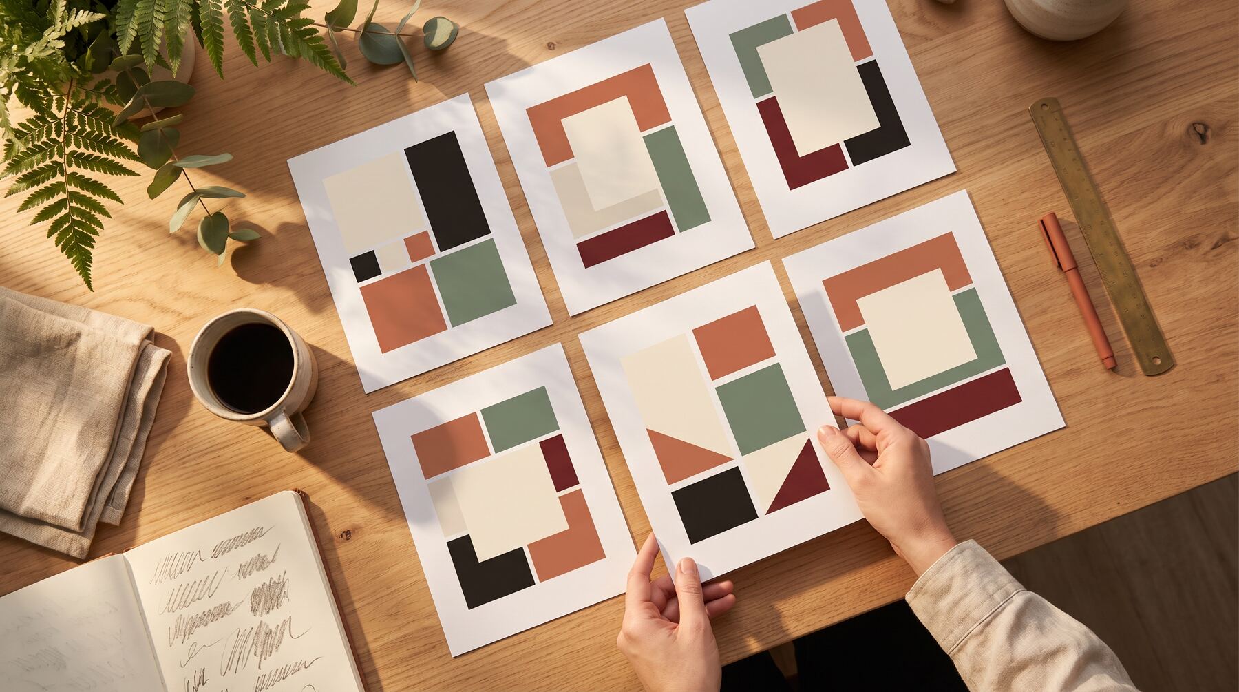
Vibrant Style Graphics: When Bold Colours Drive Engagement
In a world of muted corporate aesthetics, vibrant colours stop the scroll. Learn when bold graphics work best and how to use them effectively.

Paul Saunders
Founder, Smash It Marketing

Open LinkedIn or Instagram. Scroll for ten seconds.
Notice how most business content looks the same? Muted blues. Corporate greys. Safe, professional, forgettable.
Then something bright appears. Orange. Pink. Electric blue. Your thumb stops.
That's the power of vibrant.
The Science of Colour Attention
Human vision evolved to notice colour variations. In a sea of sameness, bold colours trigger automatic attention.
Studies consistently show:
- Colour increases brand recognition by up to 80%
- Bold colours improve content recall
- Bright visuals get more engagement on social platforms
- Colour consistency builds stronger brand associations
When your competitors blend into grey, vibrant becomes your competitive advantage.
Who Should Use Vibrant Style
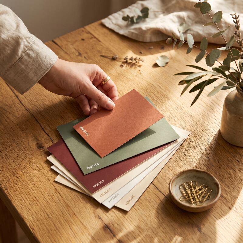
Health and Wellness Brands
Energy, vitality, and positivity—the vibrant palette communicates all three. Gyms, wellness coaches, health practitioners, and fitness businesses thrive with bold colours.Consumer-Facing Services
Businesses targeting engaged, active audiences benefit from energetic visuals. Real estate agents, event planners, and lifestyle services can stand out with vibrant branding.Creative Industries
Design agencies, photographers, and creative consultants can demonstrate their capabilities through bold visual choices.Youth-Oriented Brands
Younger audiences expect more visual energy. Vibrant palettes signal modernity and dynamism.Disruptor Brands
Companies challenging industry norms can use bold colours to signal they're different. When everyone in your industry uses blue, using orange makes a statement.The Vibrant Palette
Effective vibrant graphics use colour strategically:
Primary accent colour: One bold colour that becomes your signature. Think Spotify green or Tinder orange.
Supporting colours: Secondary colours that complement without competing.
Contrast points: White space and dark elements that let vibrant colours breathe.
Consistent application: The same colours across all materials build recognition.
Vibrant vs. Chaotic
There's a crucial difference between vibrant and visually overwhelming.
Vibrant: Bold colours used intentionally with purpose and hierarchy.
Chaotic: Multiple bold colours competing for attention with no clear structure.
Effective vibrant design still follows design principles:
- Clear hierarchy
- Adequate white space
- Readable text
- Intentional colour placement
- Brand consistency
Bold colours don't excuse poor design. They demand better design.
Platform Considerations
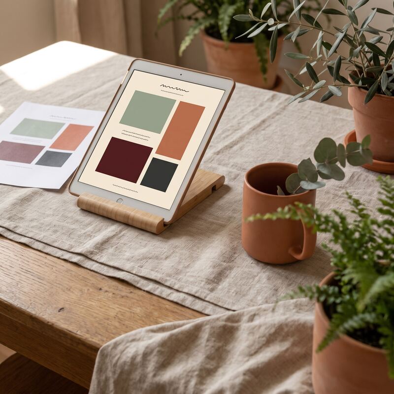
LinkedIn: Vibrant stands out dramatically against the predominantly blue/grey professional aesthetic. Use boldly.
Instagram: High visual competition requires even bolder choices. Vibrant works well but must be exceptional.
Facebook: Mixed audience means testing is important. Some demographics respond better than others.
Website: Vibrant accents can guide attention. Full vibrant saturation may be overwhelming for extended viewing.
The Brand Fit Question
Vibrant isn't right for everyone.
Consider your brand personality:
- Are you energetic or measured?
- Modern or traditional?
- Accessible or premium?
- Youthful or established?
A funeral home using vibrant pink sends confusing signals. A fitness studio using muted grey misses an opportunity.
Colour choices should reinforce, not contradict, your brand positioning.
Implementation Approaches
Full Vibrant Rebrand
Commit to vibrant across all touchpoints. Logo, website, social media, print materials—consistent bold colours everywhere.Best for: Businesses ready for significant brand evolution.
Vibrant Social Only
Keep corporate materials professional. Let social media be the vibrant expression channel.Best for: Businesses needing to maintain conservative stakeholder perceptions while engaging younger audiences.
Vibrant Campaigns
Use vibrant style for specific campaigns, launches, or seasons while maintaining a more neutral base brand.Best for: Testing vibrant appeal without full commitment.
Common Mistakes
Wrong industry match: Vibrant colours in contexts where trust and stability matter (banking, legal, healthcare) can undermine credibility.
Inconsistent application: Using vibrant sometimes and muted other times creates brand confusion.
Accessibility failures: Bold colours must still be readable. Contrast ratios matter.
Trend chasing: Following this year's "colour of the year" without brand strategy consideration.
Quality compromise: Vibrant colours highlight poor design. Everything else must be polished.
Making the Decision
Ask yourself:
- Does vibrant match my brand personality?
- Will my target audience respond positively?
- Can I commit to consistency?
- Do I have access to quality execution?
If yes to all four, vibrant style can transform your visual presence.
Ready to see your brand in vibrant style? Our Creative Packs include bold, energetic graphics designed for your specific business and audience. View examples or contact us for a custom preview.
Related services: data-led content creation backed by SEO, and ready-made Creative Packs for branded graphics.
Paul Saunders
Founder of Smash It Marketing — a boutique, AI-first agency pairing 18 years of Google Ads with an AI-first service suite. Book a call.